

- With your branding
- Dashboard
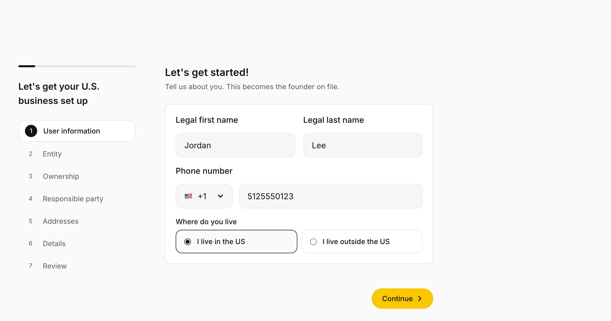
- doola's defaults
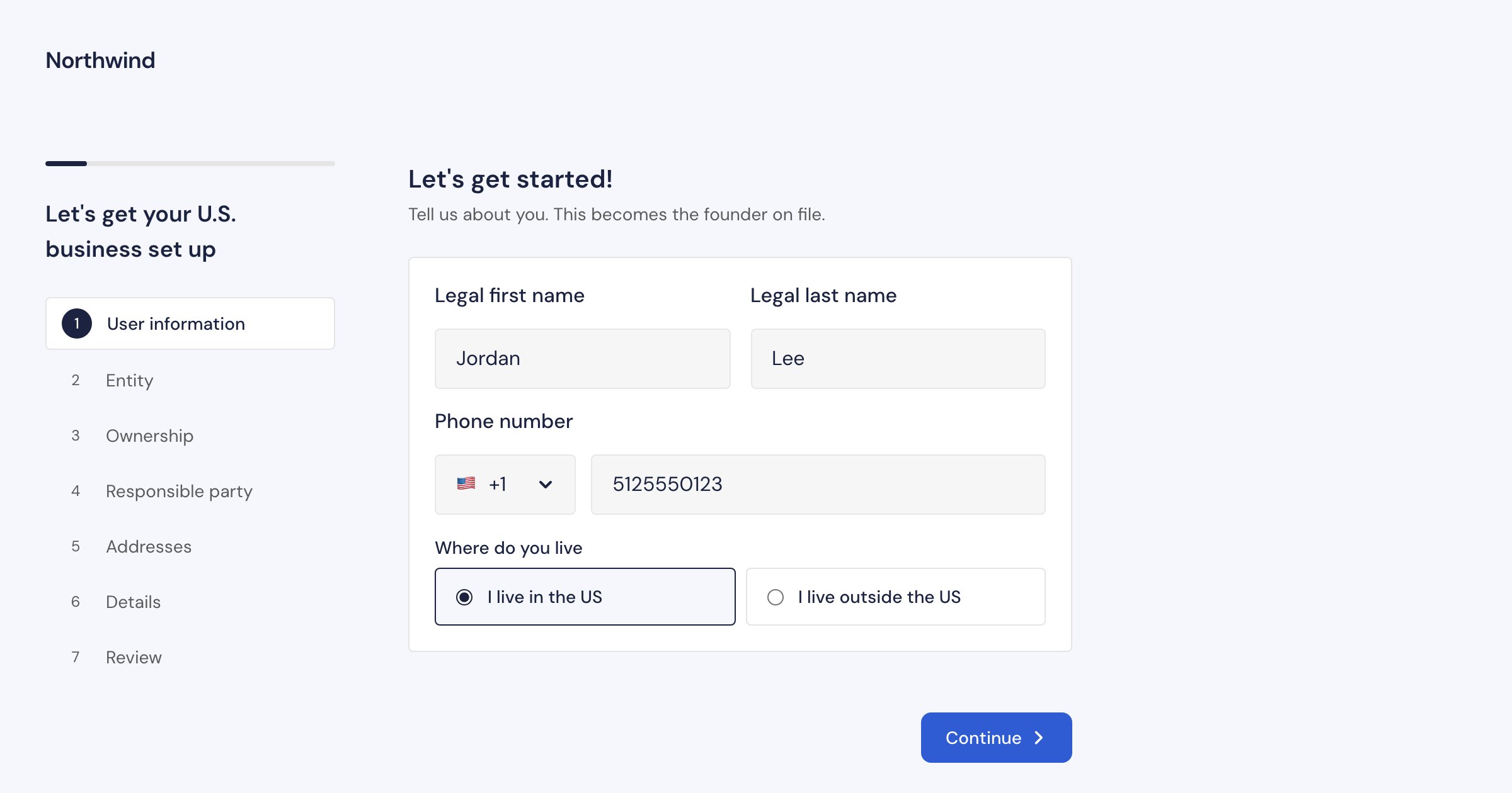
A sample partner, Northwind: brand name, colors, DM Sans and 4px corners.
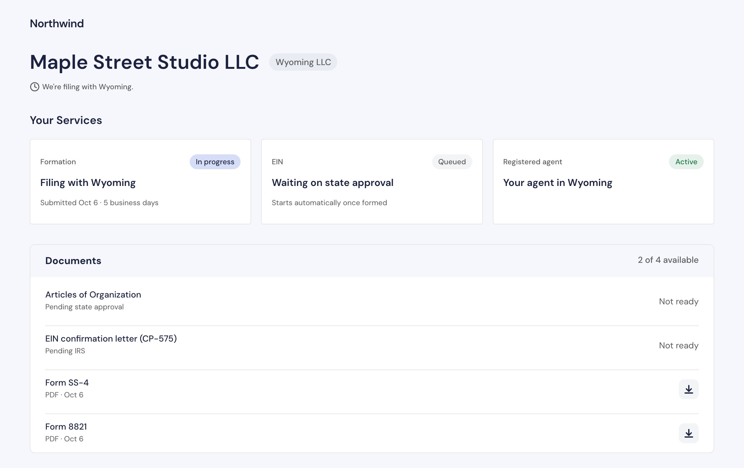
What you can set
Each environment is a separate partner account, so set your branding in the sandbox portal and in the production portal.
Pick colors that read well
- Button text follows your primary. It turns white on a dark primary and stays dark (
#141414) on a light one, whichever reads better. A mid-tone primary can fall short with both, so check that one of them reaches a contrast ratio of at least 4.5:1. - Some neutrals are fixed. Muted text, card surfaces and borders keep doola’s neutral grays so every screen stays legible on any background you choose. Pick a background close to white or a light tint.
- Check every screen. The wizard, the payment screen and the dashboard all use your colors. Check them in the portal’s preview, then walk through them in sandbox before you go live.
Defaults
Anything you leave unset falls back to doola’s defaults: a yellow primary (#F9C800), a blue secondary (#4F8FF6), a near-white background, Inter, and 0.75rem corners, which keep buttons fully rounded. With no logo and no brand name, the top of each screen stays empty.
The iframe paints doola’s defaults for a moment while it loads your branding. Mount it where a brief color change is not distracting, or start the connections early with preconnect hints.
What stays doola
The flow is white-labeled. The founder sees your logo and colors and no “Powered by doola” line. doola’s name still appears in two places:- the registered agent, which doola provides: “doola Registered Agent (included)” on the Addresses step, and “Registered agent: doola (included)” on the review;
- the message shown when the founder’s email already belongs to a doola account of their own.